Wycombe High School
More than just results
Building brands with purpose takes on special significance for us when it has a positive impact on our community. When local girls’ grammar school Wycombe High encouraged us to pitch for a brand and people development project, we had the opportunity to achieve just that.
Having previously worked on a relaunch of their Sixth Form Brand and developed a brand purpose and collateral for their connected teacher training SCITT, NMAPS, we had a good grasp of Wycombe High’s competitor landscape and their positioning in the marketplace.
There was no doubt that this was already a thriving school – exam results and league tables spoke for themselves – but their Senior Leadership Team knew that they had more to offer than academic excellence. Their school had something unique, a little bit of extra magic, they just didn’t know how to express it succinctly and in a way that would engage prospective parents.
Our job was to identify that ‘special something’ and craft a new brand story for the school; one which propelled it to the next level, over and above stiff competition in the area. We were also tasked with re-energising the school’s staff around a common vision, utilising our tried and trusted ‘Heartbeat’ methodology.
The voices in the room
We kick-started the process with the ‘Heartbeat’ – updating the school’s vision, mission and values statements to realign and empower staff.
The school was determined to ensure that the full breadth of stakeholders was included in the process. We started with parents, devising a questionnaire which asked ‘what attracted you to send your daughter to Wycombe High?’ and ‘what is the school’s reputation amongst your friends and family?’, before conducting three workshops with staff and governors to dig deeper into their perceptions of the school from the inside.
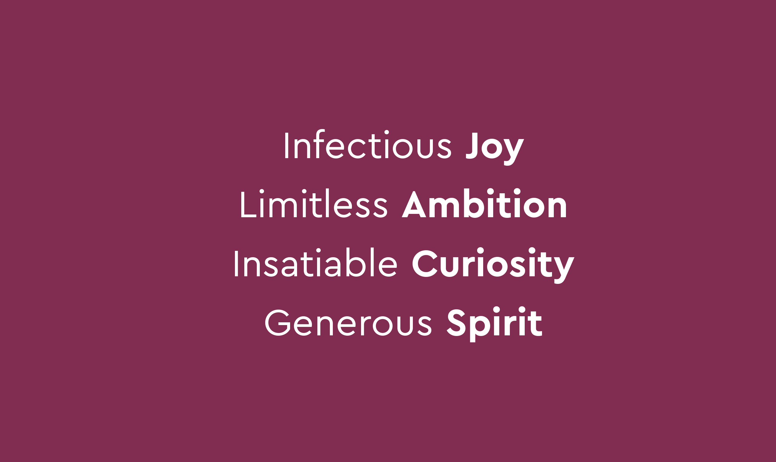
It was becoming clear to us that Wycombe High’s pre-existing vision, mission and values, and indeed external brand, was missing something – an essence which was beyond the ordinary, exciting and needed to be talked about.
A rallying call for staff
One thing was for certain; Wycombe High’s new vision, mission and values had to have the students at its heart. We played back several options and the Senior Team decided on a route with ambition, energy and a sense of journey.
—
“A school where students relish challenge, chase excellence and inspire those around them at every stage of their lives.”
Wycombe High School, Vision Statement (2019)
—
With this in mind, we crafted a compatible accompanying mission and four emotive values statements, intended to drive cultural change in the school.
“We build an ambitious and compassionate community of people who contribute eagerly to school life. We provide opportunities which propel our students out of their comfort zone, whilst supporting them at every stage and guiding them towards diverse futures.”
Wycombe High School, Mission Statement (2019)
Making a statement
With the Heartbeat agreed and beginning to take hold, we switched our focus to Wycombe High’s external brand. What would their go-to-market thought be?
On the journey so far, we’d established three things:
1) Wycombe High truly believes in its girls and what they can achieve
2) Wycombe High is about more than results as a school
3) Wycombe High has a reputation as a ‘first movers’ in education
So, how might we capture these three defining statements in one singular brand thought which positions the school, encapsulates the school’s ethos and draws attention?
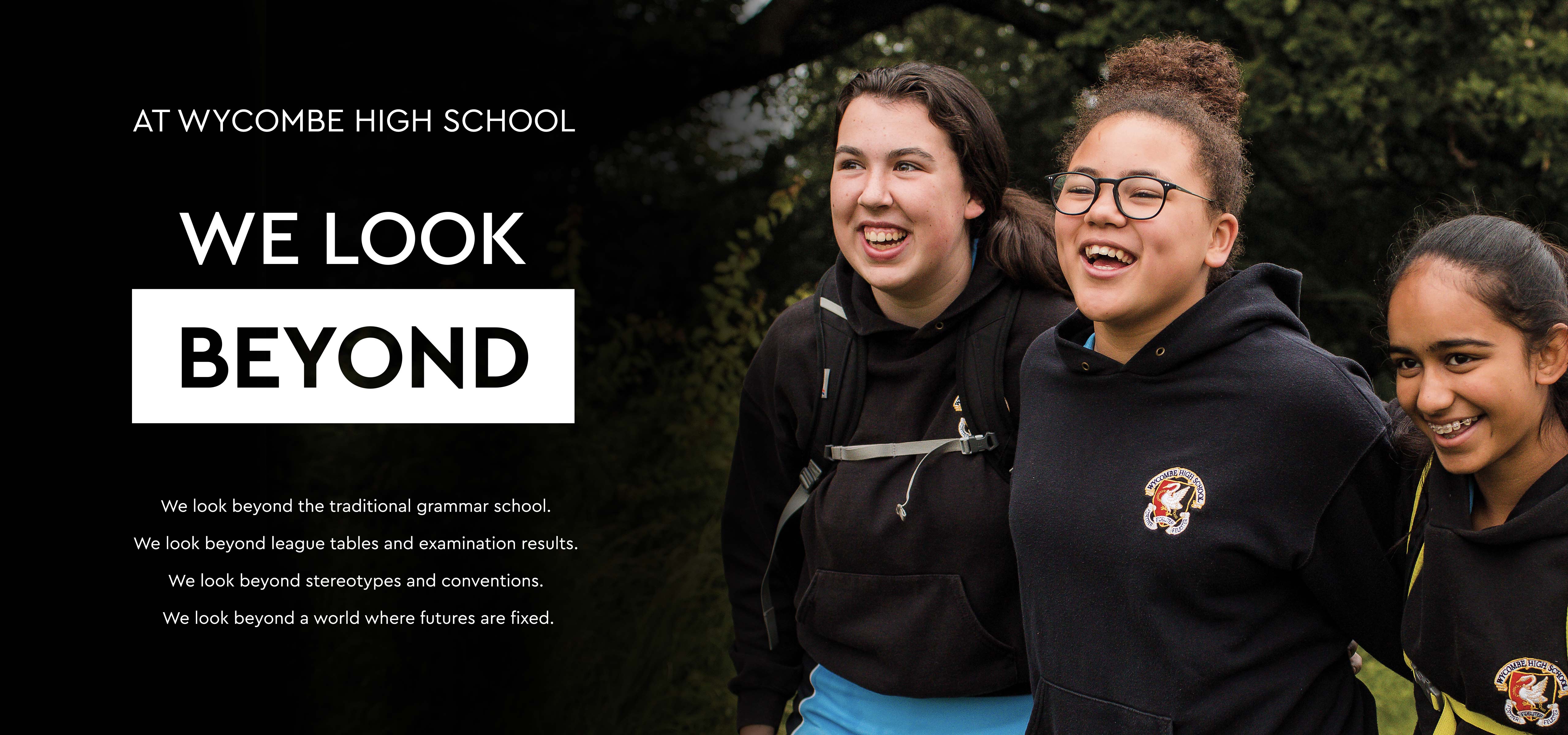
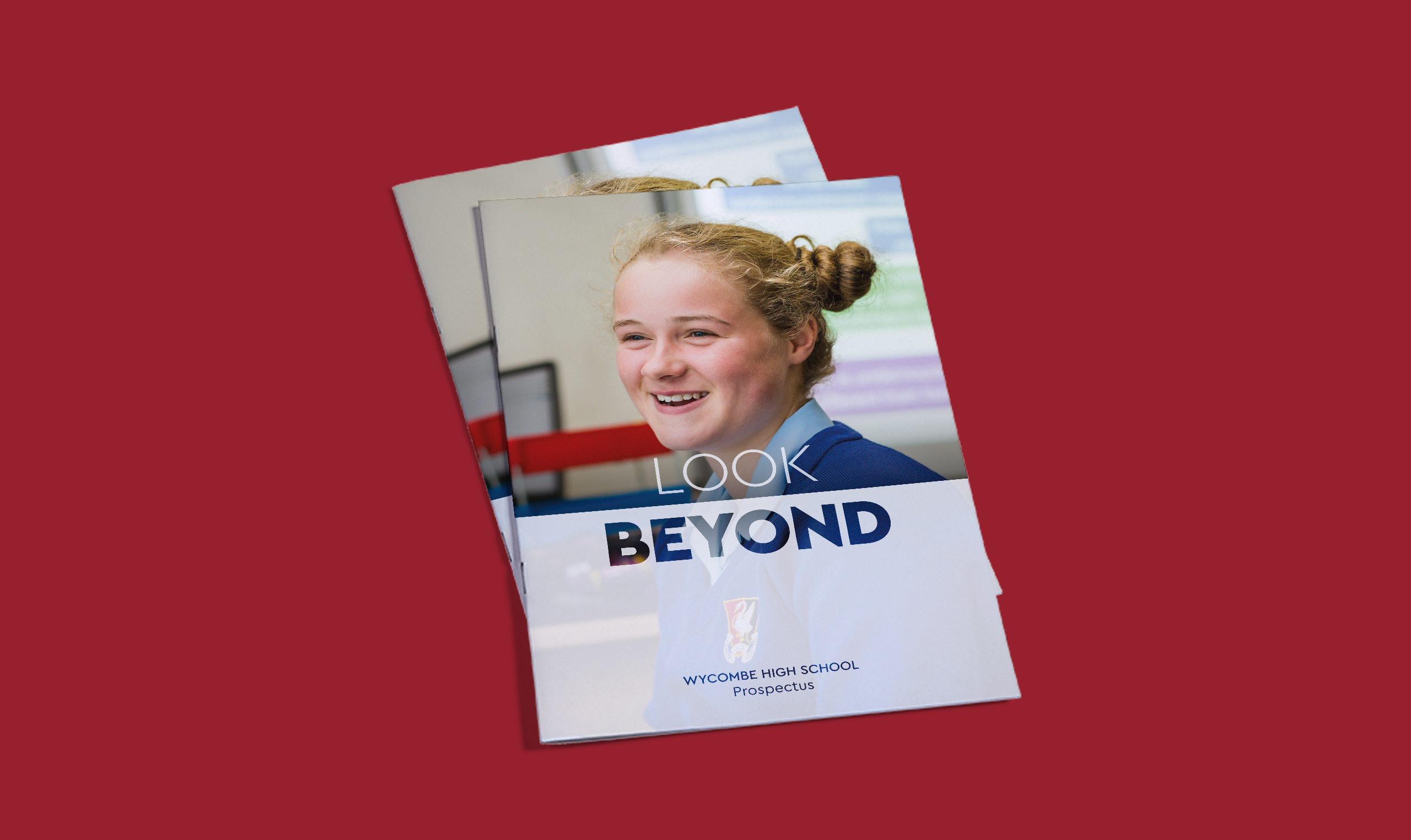
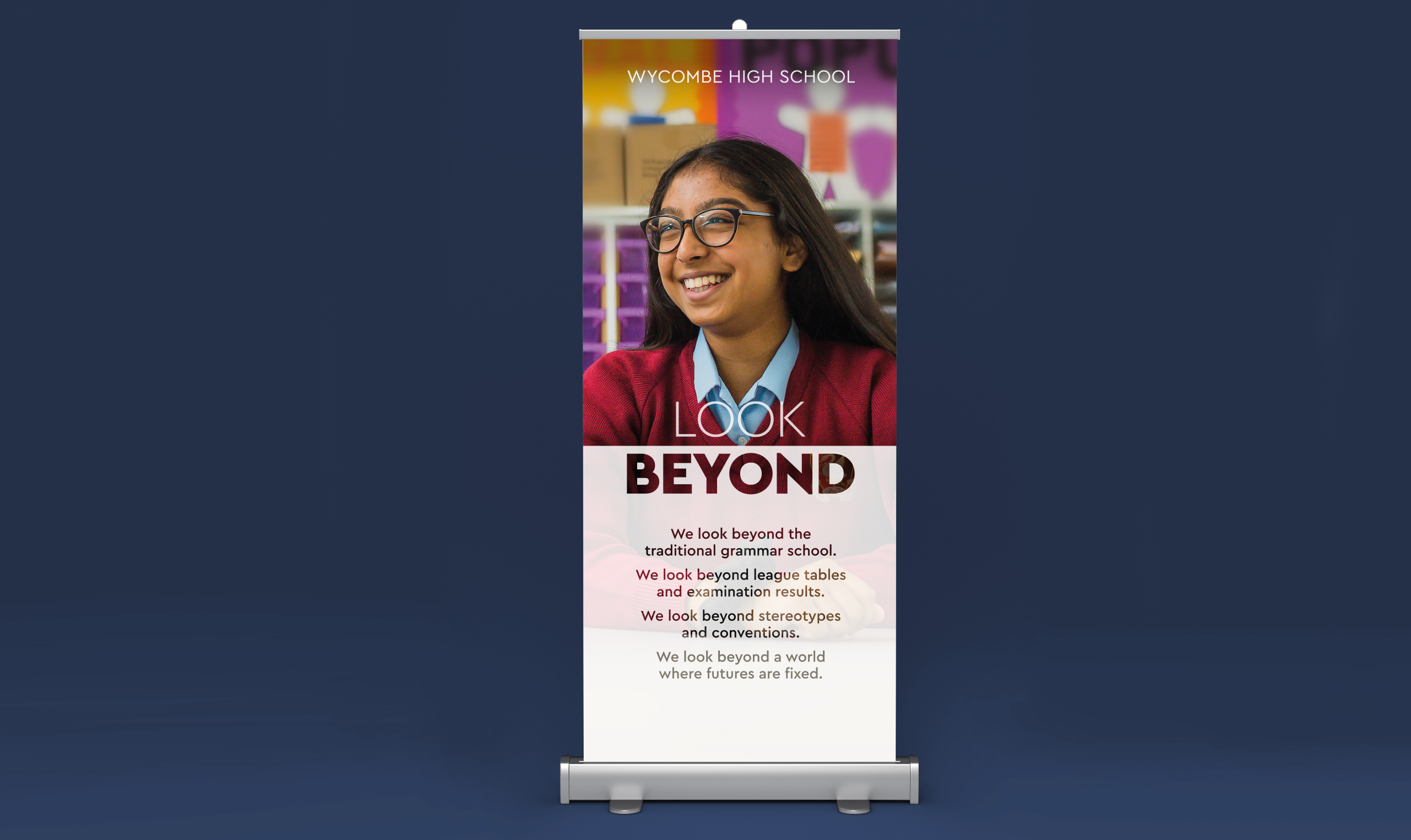
Our answer? Look Beyond.
Throughout the process of working with Wycombe High, we were struck by their inclusivity, their unswerving ambition for their girls and their rejection of stereotypes, conventions and deficient statistics. This was a grammar school like no other and their brand story had to reflect this.
Beyond means bold
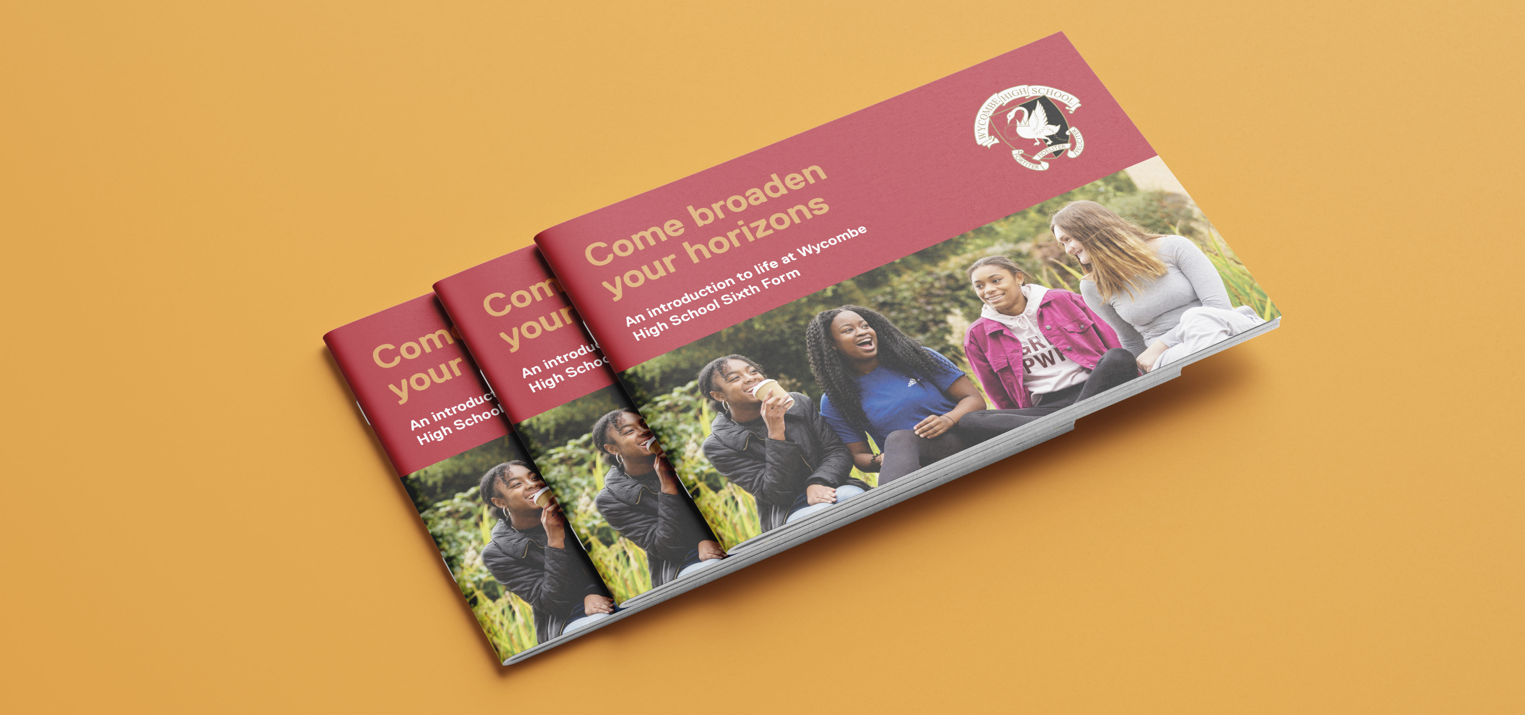
With momentum building behind an aptly challenging brand thought, and an Open Day fast-approaching, we needed to ensure that Wycombe High’s visual identity packed similar punch.
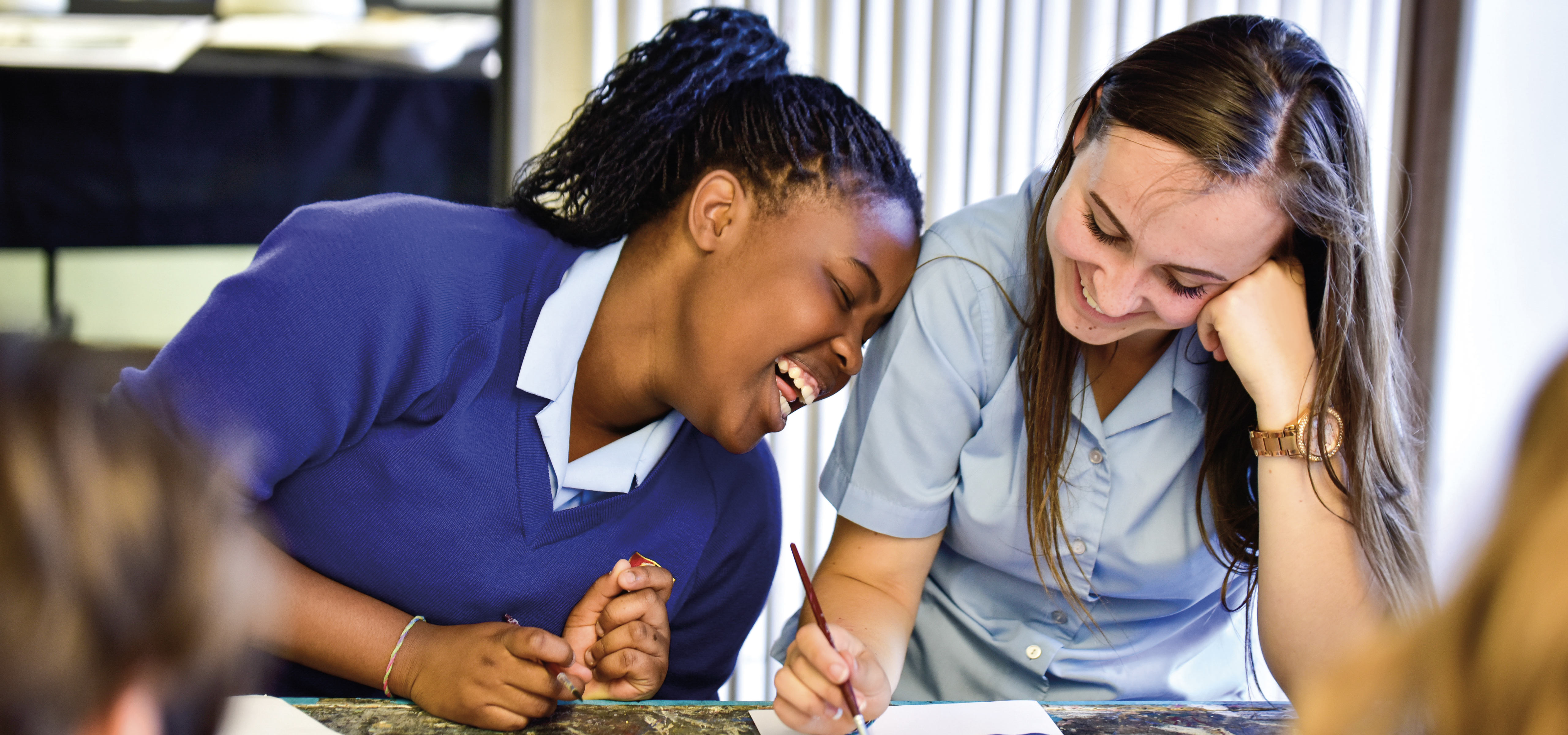
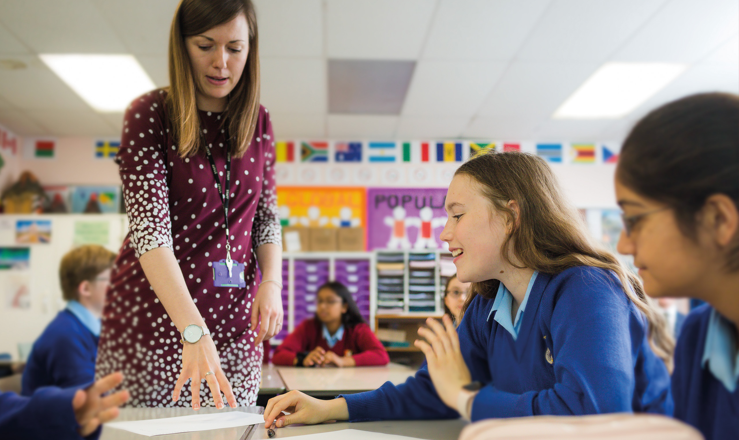
We placed the girls at the core of our design thinking, creating an impactful, daringly simple, photography-led identity. We art-directed a photoshoot at the school, capturing images of the girls expressing joy, pushing their limits and experimenting with activities which challenge stereotypes and convention.
We used a typeface which is modern and unfussy, to reinforce the school’s forward-thinking approach to education and inclusivity, and introduced a new graphic device. The frosted filter with contrasting transparency and opacity nodded to the ‘Look Beyond’ brand thought.
Simplicity of thought, executed with sophistication.
“Our staff were delighted that ABA ‘got us’ and worked so very much in partnership with us. They were uplifted by both the process and the end result.”
Sharon Cromie, Headmistress