Lee Valley Leisure Trust
Leaving a lasting legacy
Years of hard work. The early mornings, the late nights, the sacrifices. Constant comparisons to the planet’s best. And then – a chance to perform with the whole world watching. Preparing for an Olympic Games is quite an undertaking, and not just for the athletes competing. Getting the venues ready was a feat all of its own.
But what happens when the medals have been awarded and the spectators have departed? That was the challenge facing Vibrant Partnerships when they approached us to develop a visual identity.


Not a venue. A destination.
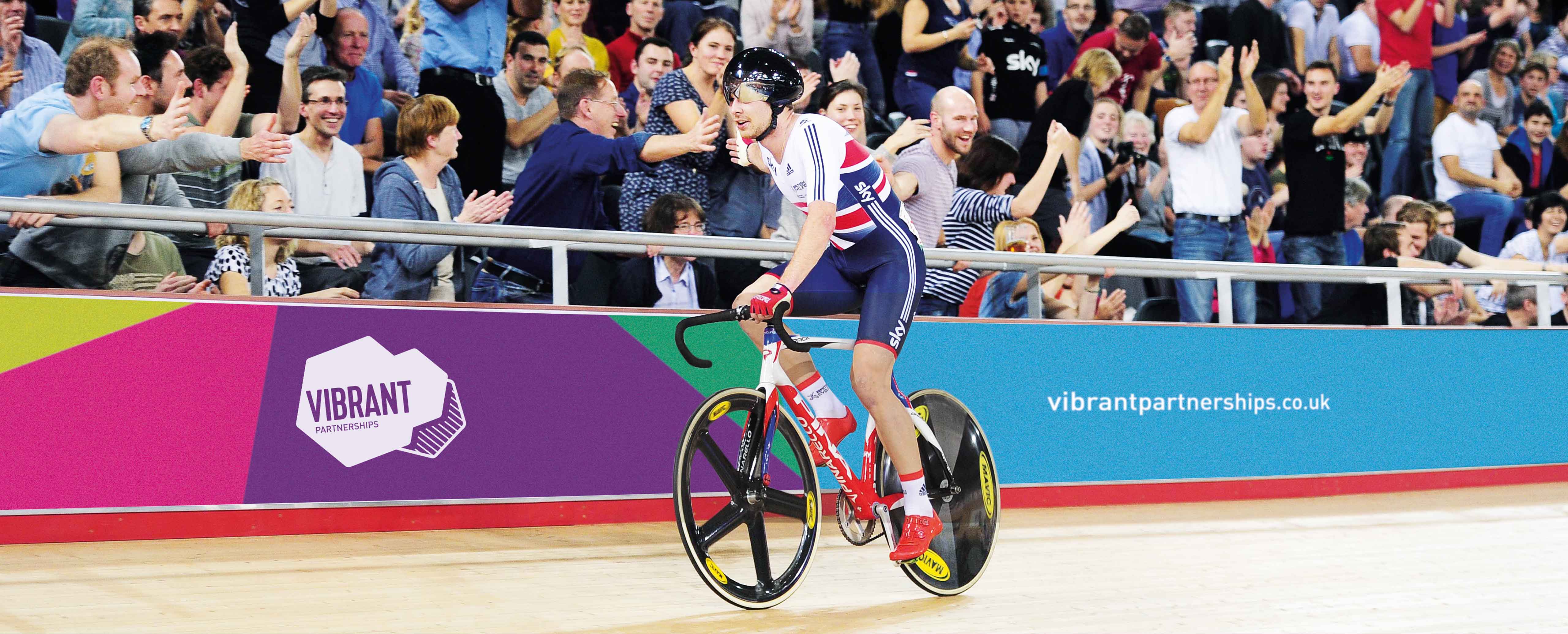
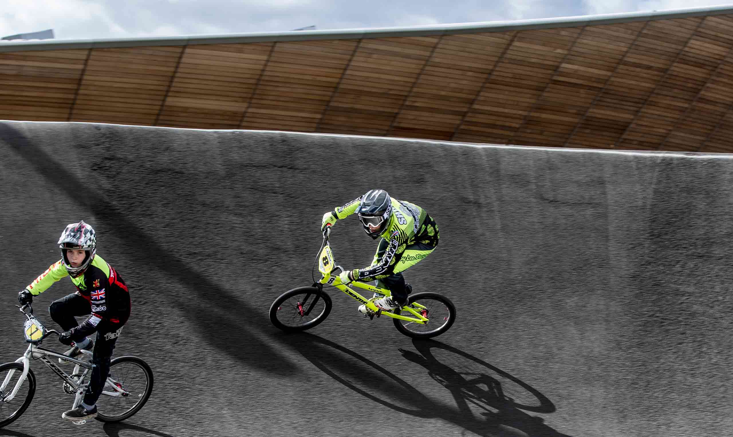
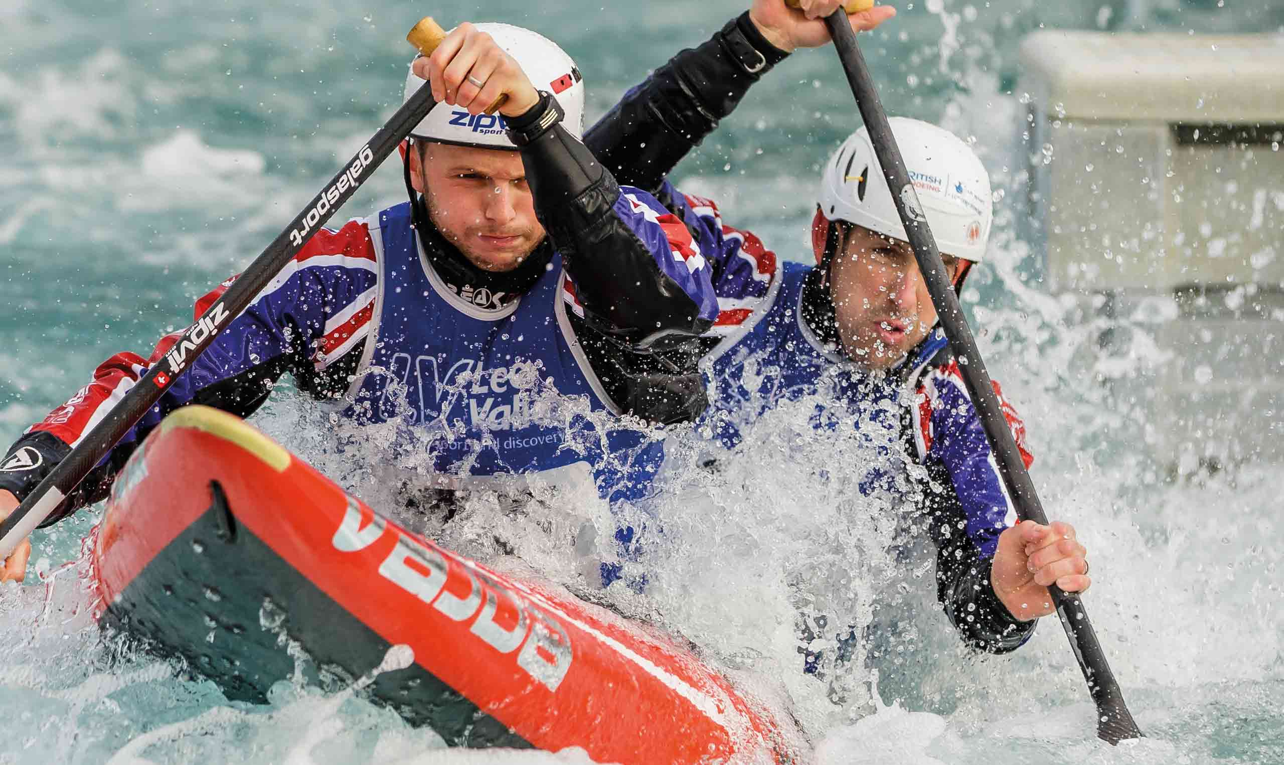
Three of the London 2012 venues – VeloPark, White Water Centre and Hockey and Tennis Centre – are part of the portfolio of leisure facilities owned by Lee Valley Regional Park Authority (LVRPA). After the Games LVRPA decided to establish a venue management arm, Lee Valley Leisure Trust, to maximise the potential of its portfolio. The Trust would operate as a supplier to LVRPA, and be free to acquire further, non-LVRPA contracts in future.
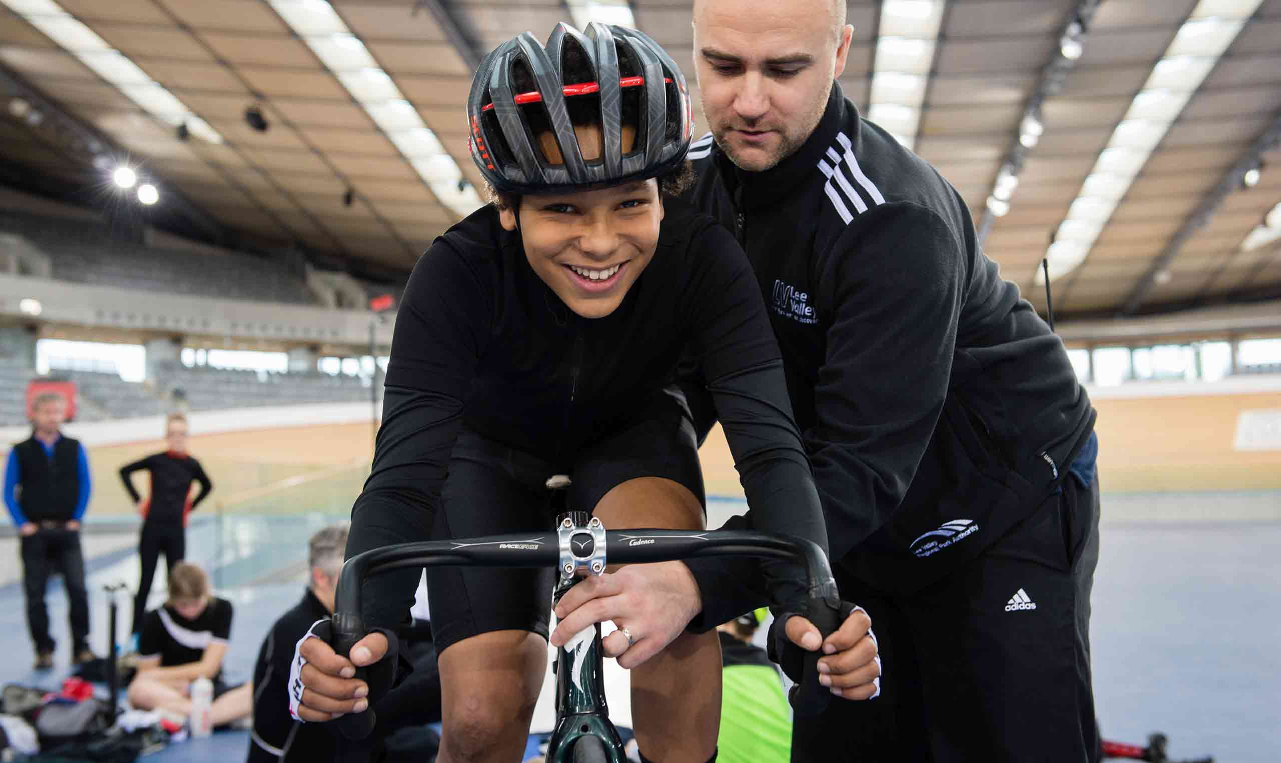
So far, so public sector. But Lee Valley Leisure Trust set their sights a little higher. It wasn’t enough for them to run the venues quietly and effectively. Their vision was to turn venues into destinations. To attract amateur sportspeople as well as elite athletes, and businesses as well as local communities. They wanted to be known for managing a portfolio which buzzed with life and excitement. And they wanted a brand to match.
The magic’s in the intersection
First task out of the gate was to develop a name slightly less public sector-y than LVRPA or Lee Valley Leisure Trust. So we embarked on a name generation project with the key client team and arrived at a name which set the bar pretty high. ‘Vibrant Partnerships’ communicated two key tenets of their approach, and immediately set them apart from their public sector peers.
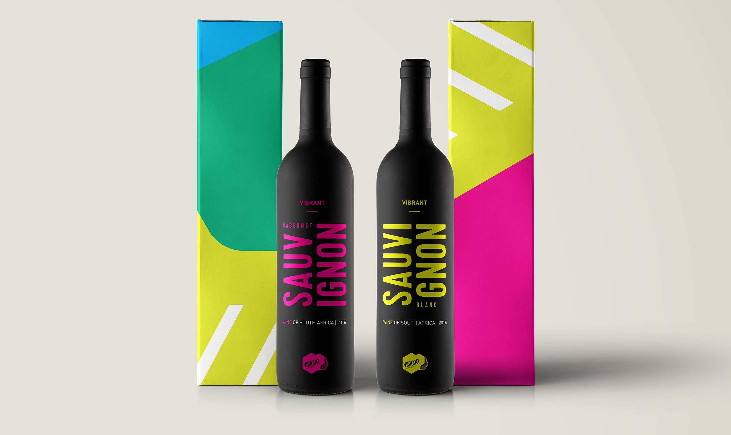
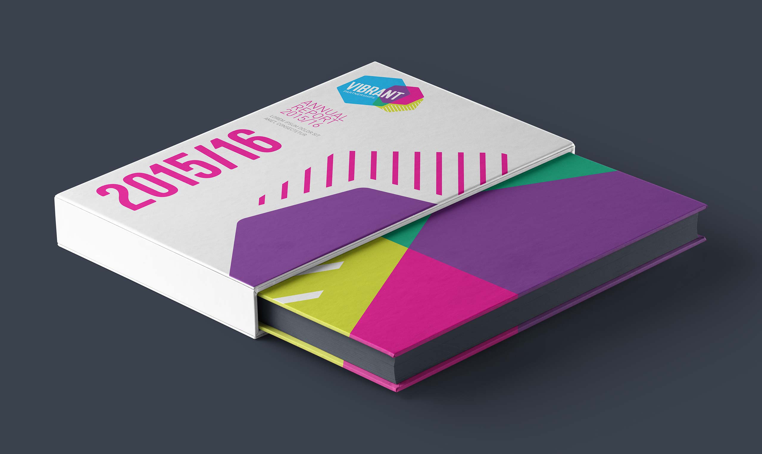
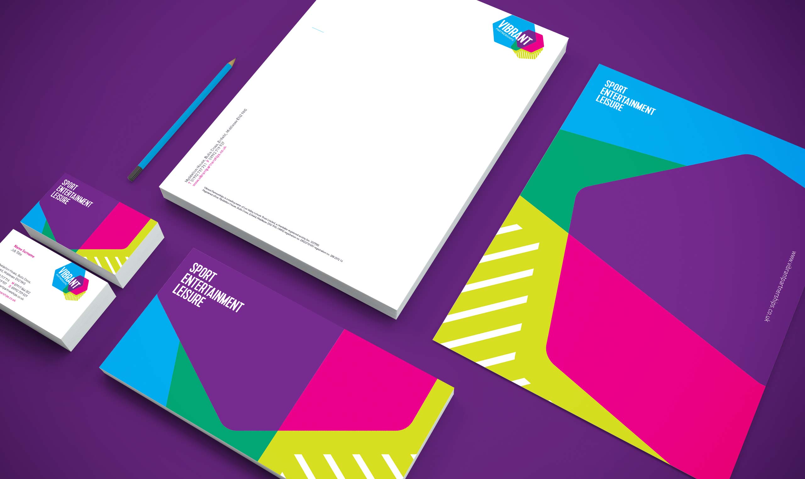
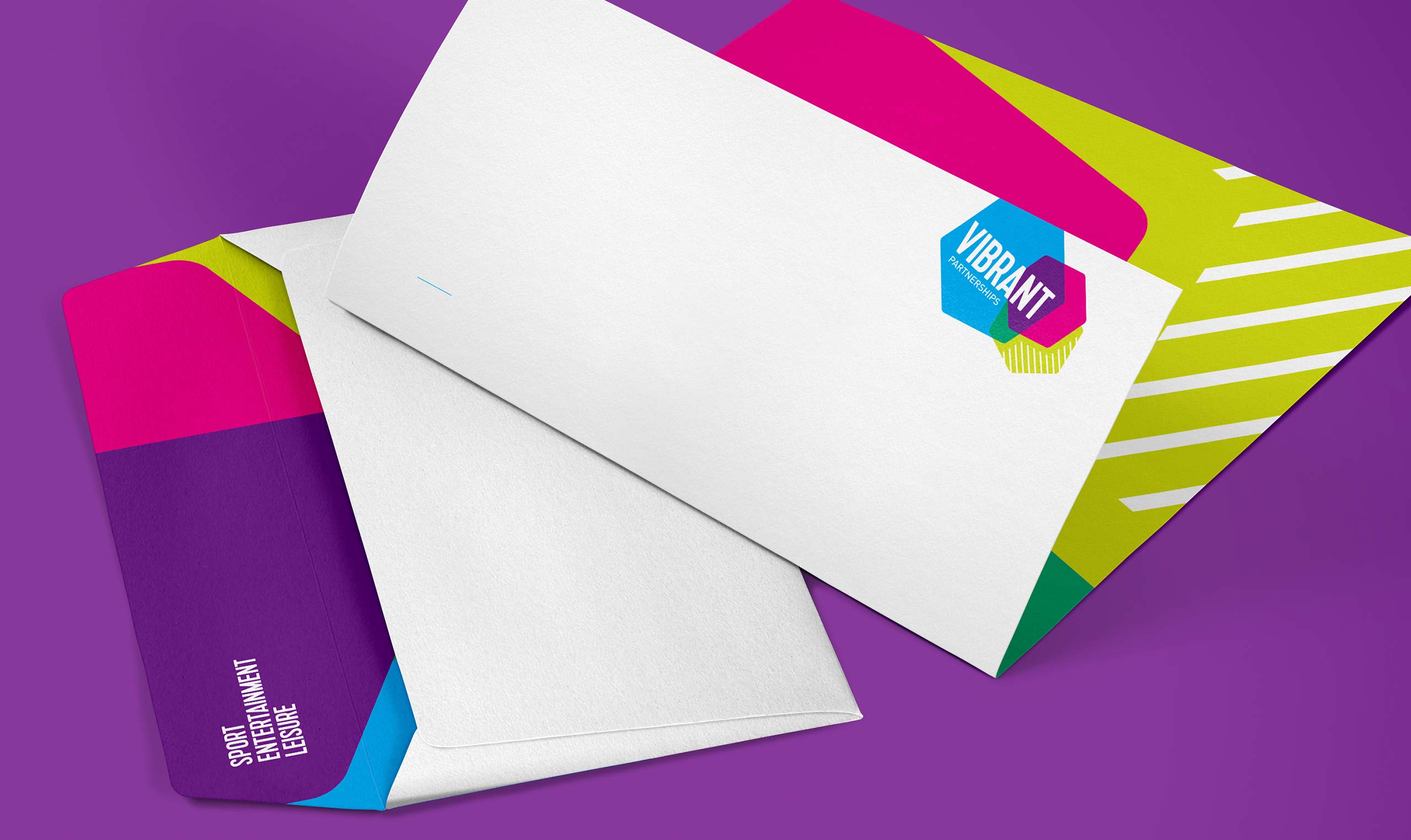
We then set about developing an identity which would live up to their name. We created a logo which explored the idea of intersection – the intersection of three coloured hexagons creating a range of interesting angles and lively colours, and reflecting the intersection of Vibrant’s commitment to three core values of excellence, experience and service. To convey that sense of life and excitement we tried to create a feel of the logo barely containing itself; an objective which we carried throughout other elements of the project.
From the logo flowed not just the colour palette but also a distinctive and flexible brand pattern, a typographic approach and a means of housing imagery. We also developed a ‘SPORT ENTERTAINMENT LEISURE’ device to quickly communicate what Vibrant were all about.

An unexpected surprise
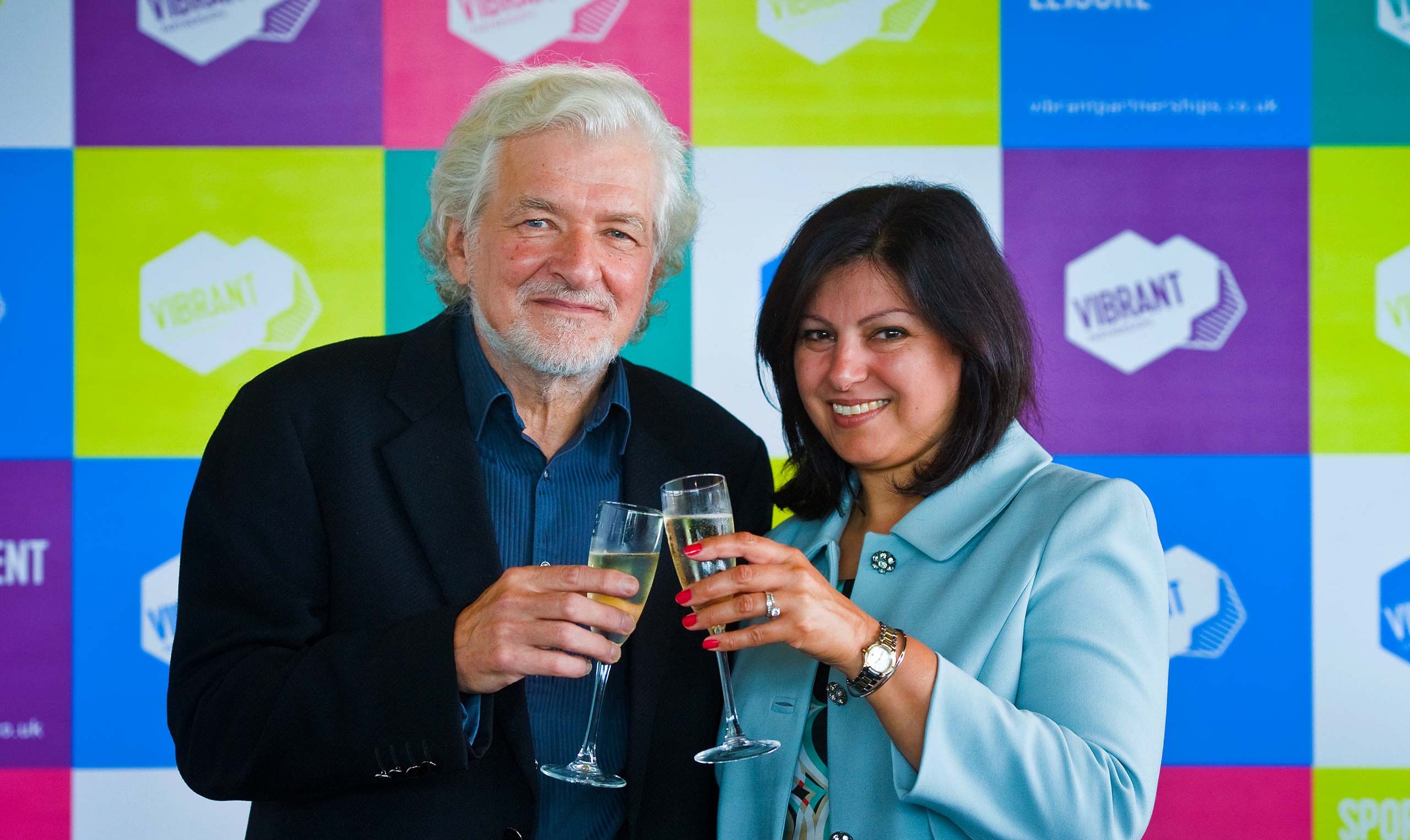
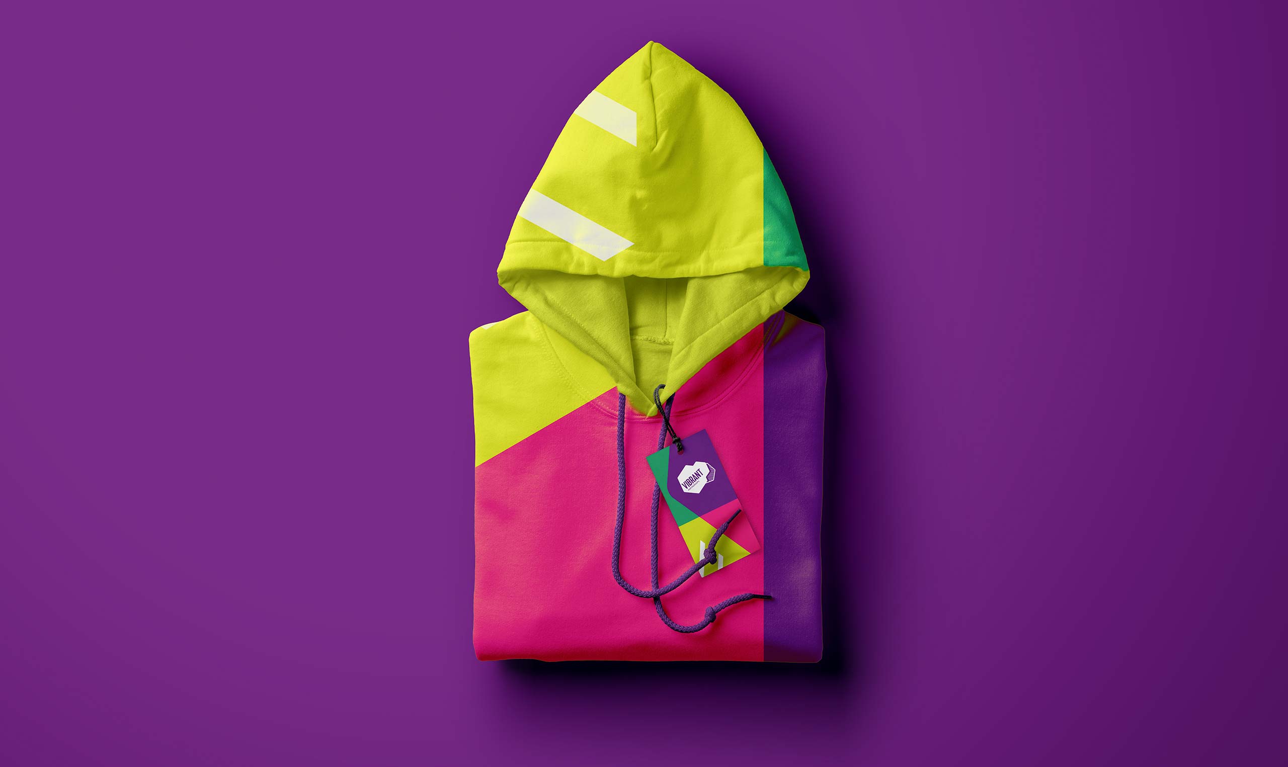
We’ve continued to work with Vibrant on a range of marketing and brand building projects, including producing press adverts, competition collateral and trade materials. In a satisfying but unexpected turn of events, what was originally conceived as a behind-the-scenes, B2B brand has been so well-received that it is featuring in ever more end user-facing materials. You can’t keep an energetic logo down!